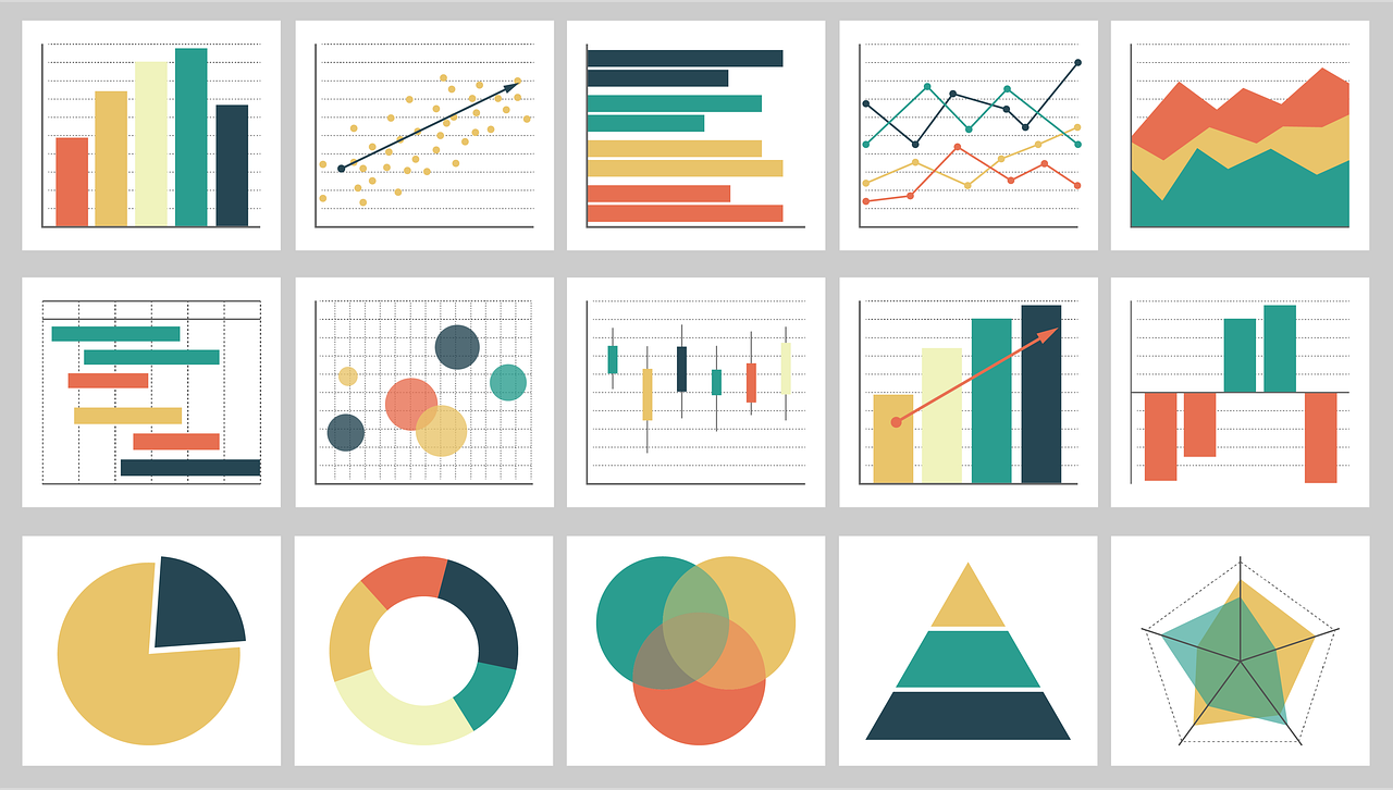
As professionals involved in Monitoring and Evaluation (M&E), we understand the significance of effectively communicating the findings and outcomes of our work. One powerful way to convey complex data and insights is through charts and visualizations. These visual representations can help stakeholders grasp key information quickly and make informed decisions. So, let’s dive into some essential charts that you should consider incorporating into your M&E reports!

Line Charts: Line charts are ideal for illustrating trends over time. They showcase the progression of indicators, allowing viewers to identify patterns, fluctuations, or shifts. By plotting data points across different time periods, you can showcase the impact of interventions, track progress towards goals, or highlight changes in outcomes.
Bar Charts: Bar charts are excellent for making comparisons between different categories or groups. They enable you to showcase the distribution of data or compare the performance of various interventions or target groups. Consider using stacked or grouped bar charts to present multiple variables or indicators side by side, enhancing the visual impact.
Pie Charts: Pie charts are great for representing proportions or percentages. They can help communicate the composition of a whole or the distribution of different elements within a dataset. Use pie charts to illustrate the distribution of resources, budget allocations, or to highlight the contribution of different program components.
Radar Charts: Radar charts, also known as spider charts, are effective for displaying multiple dimensions or variables. They allow you to compare and contrast different elements based on several criteria simultaneously. Radar charts are especially useful when assessing the performance or impact of multiple projects or programs across various dimensions.
Gantt Charts: Gantt charts provide a visual timeline of activities and their durations. They help in depicting project schedules, highlighting dependencies, and tracking progress. Gantt charts are particularly valuable when reporting on project milestones, implementation timelines, or evaluating project delays or bottlenecks.
Scatter Plot: A scatter plot is suitable for analyzing relationships between variables. It can be used to show correlations between project inputs and outputs or to explore cause-and-effect relationships.
Heatmaps: Heatmaps are powerful for showcasing patterns and relationships in large datasets. By using color gradients to represent different values, heatmaps allow you to identify hotspots, concentration areas, or areas of success and challenges. Heatmaps can be used to analyze geographic data, track program coverage, or assess performance across different regions.

Bubble Chart: A bubble chart is effective for displaying three variables simultaneously. It can be used to illustrate the relationship between indicators, such as the size of the bubble representing the magnitude of the data point.
Histogram: A histogram is useful for presenting the distribution and frequency of data. It can be used to analyze the distribution of outcomes, such as beneficiary satisfaction levels or performance ratings.
Dashboard: A dashboard combines multiple charts and graphs on a single screen to provide an overview of key M&E indicators and performance metrics. It allows for easy comparison and analysis of different data points.
Remember, the choice of charts should align with the objectives of your M&E report and the preferences of your target audience. Additionally, consider adding titles, clear labels, and legends to enhance comprehension. Don’t hesitate to experiment with different chart types or combine them to create more comprehensive visuals!
By leveraging these charts in your M&E reports, you can transform complex data into accessible and impactful insights. Your stakeholders will appreciate the clarity and precision these visual representations bring to your evaluations. So, start charting your M&E journey towards improved communication and informed decision-making!